Pantone Colour of the Year
Within the interior design industry, there is an exciting calendar date that comes round every year that can heavily influence your work; The Pantone Colour of the Year announcement.
Pantone are known as the worldwide authority on colour, and with their expertise and vast experience, they accurately forecast the year’s most popular shades.
2015 will be the year of Marsala; a warm, red hue that we are confident will be showing up in interior design concepts for time to come.
We were asked to give our opinion on this seductive and subtle shade by Amara and we gleefully accepted.
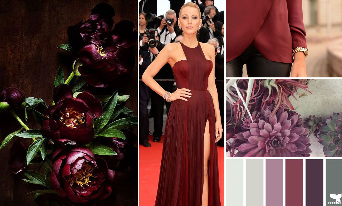
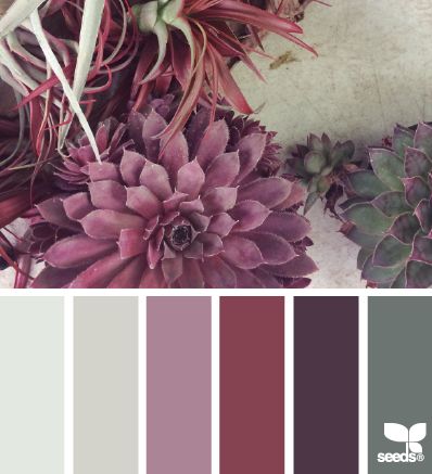
“Marsala is an incredibly versatile colour. A red with heavy brown tones it’s unusual in its ability to both stand independently as a strong, vibrant, succulent colour and also to act as a neutral. Unlike primary or secondary colours that can clash, Marsala works with anything. Pair with flesh tones and grey as an accent colour or let it melt into the background, becoming moody and sensuous with black and dark greens.”
Top tip: For a moody and sensuous atmosphere pair with black and dark green
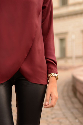
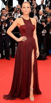
Unlike primary or secondary colours that can clash, it works with anything. See it here with flesh tones and with grey as an accent colour:
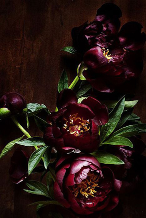
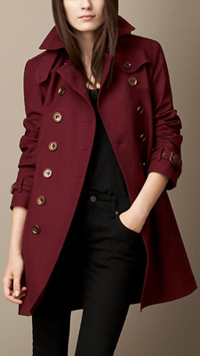
and here melting into the background and becoming moody and sensuous with black and dark greens:
I am currently working on a project that includes marsala, peach, black and a splash of gold as the colour palette in the kitchen: